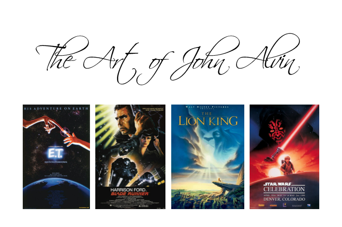
TOP TEN MOVIE POSTERS BY JOHN ALVIN
There are so many anniversaries for great movies this year. Part of the list includes the 40th for Blazing Saddles and Young Frankenstein, and the 20th for the great Disney 2D film, The Lion King.
Those movies all features one-sheet posters by artist John Alvin.
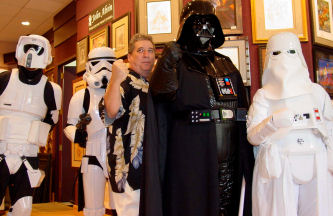
John Alvin used to say his job was to “create the promise of a great experience”. John was a huge movie fan his whole life. He wanted to inspire as many people to go see new movies, and get excited about them, as possible. He never saw the subject matter he chose as any less valuable or worthy than any other more “fine art” friendly work on display in galleries. Movie art was art in his book. He approached it as such every day as an artist. Alvin was humble and sensitive, and often flew under the radar. As studios rarely allowed signatures or credits on their one-sheets, even today there is often confusion about posters to his credit.
Here, in honor of the book The Art of John Alvin being released about his career (which for you lucky ducks going to San Diego Comic-con, will be previewed there by the publisher Titan Books) are the top ten posters of the over 200 for which Alvin was responsible, aided by commentary from his wife Andrea Alvin, The Art of John Alvin author and John’s artistic partner at Alvin & Associates…
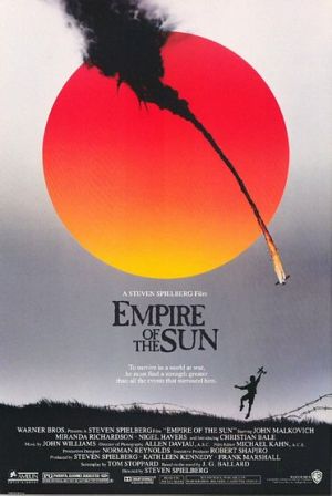
10. EMPIRE OF THE SUN
For this Spielberg directed movie, John juxtaposed two strongly contrasting moods and colors to show loss of innocence, while cleverly incorporating the feel of the Japanese flag. This image was so iconic it was the single poster used for everything, all over the world. A perfect example of the movie’s name conjuring an image of the poster.
Andrea Alvin: “This poster tells it all in the single graphic image. The plane is going down with a cloud of smoke and fire and silhouetted in the horizon we see the boy, enamored with the war, joyously playing with his toy plane on the field with the barbed wire. We understand that even with the horrors of war and imprisonment, that the boys youthful enthusiasm cannot be crushed.
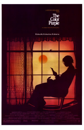
9. COLOR PURPLE
Also a Spielberg movie, based on the novel by Alice Walker. It was essential to create an image that rang true to the millions of fans of the book, while enticing new ones to come see the film version. Note that we cannot see the star’s face, and it is entirely in shadow…
Andrea Alvin: “This is another example of the scene that was not in the movie. We see Whoopi Goldberg’s Celie sitting in a rocker a lace curtain behind, reading a letter. There is a mood of tranquility and hope, but with an edge of melancholy. So much said with so little. It is again, John’s ability to create a mood with graphics and color that sets this poster apart.
”
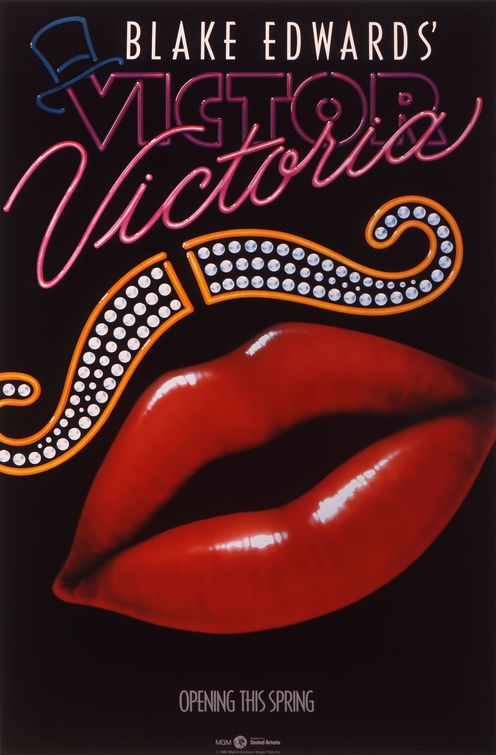
8. VICTOR VICTORIA
One of the most recognizable graphic posters in recent history, (along with Jurassic Park, which John also worked on) it is about a female performer who becomes famous by pretending to be a man who is a female impersonator. Also important (as Andrea repeats below…) because the same image was used for both the movie and the stage play. John and Andrea’s daughter Farah has gone on to be a broadway actress and singer.
Andrea Alvin: “This poster was important because it was such a bold graphic statement and uniquely different from any poster before it. It didn’t show the big stars, Julie Andrews and James Garner. It was also used for the successful Broadway show based on the movie. I don’t think that had been done before. Our daughter Farah was singing at an event and we met Henry Mancini. He was very excited to tell me that they were going to use the art for the Broadway production.
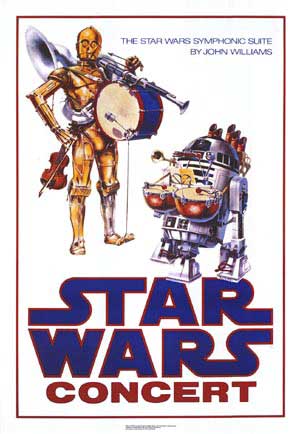
7. STAR WARS CONCERT POSTER
Among Star Wars geeks (of which I am unabashedly one) this poster is the holy grail. It was created for a show with John Williams that never took place, and only a few thousand got out into the public. The charm of the image “struck a chord” with fans and it has become a thing of legend.
Andrea Alvin: “This poster has become the most collectible of all the Star Wars posters both because of its rarity and because of its unique graphic quality that sets it apart from all of the other Star Wars posters. It is simple and graphic and has a sense of whimsy that is rare in the SW universe. John , being a huge SW fan, made sure the characters were perfectly on model and that the “instruments” they used fit in seamlessly.”
Here is the quote George Lucas put on John’s website when he died. George was a big fan of John’s, and a big collector of his art:
Thirty years ago, John Alvin created one of the most memorable — and whimsical — illustrations ever to grace a Star Wars poster. In the years since, he has become one of the finest illustrators in his trade, flourishing in a field that is quickly becoming a lost art. We are so fortunate to count John’s talent among the treasures of the saga’s legacy, and will deeply miss him and the passion for Star Wars he so successfully expressed through his art. — George Lucas
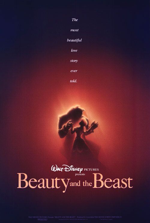
6. BEAUTY AND THE BEAST
The Beauty and the Beast poster was created when they were still tweaking the look of the characters…the image showed the magic of romance and problem solved at the same time, by not showing them in close up–that kind of successful resolution is the sign of the very best illustrator.
Andrea Alvin: “This was the first poster by Disney with the intent to target an adult audience. John was able to evoke a mood of mystery and romanticism that is rarely seen in illustration and movie posters.
” 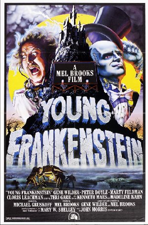
5. YOUNG FRANKENSTEIN
I remember John saying this was one of his favorite pieces, because he loved the movie so much and was so proud to be a part of it. There is obviously parody of older classic monster posters in this image, but the little gags inform the viewer they’re in for a comedy. As classic as this movie is (#13 on AFI’s top 100 comedy list) we still often think of the poster, but this one is a perfect example of “the promise of a great experience”. It makes me want to watch it again…
Andrea Alvin: “The monster was big and everything on the poster felt big. We really saw the personalities of the main characters. John always said that these posters for a comedy movie worked because the art was taken very seriously. It was bold and iconic and probably Mel Brook’s best movie. At least it’s my favorite. It had the notoriety of being the worlds largest billboard at the time, when it was painted on the side of the Playboy building on Sunset Strip.” ….Right about now I should mention that after Farah was born John always hid the word CAKE in his movie poster art, which was a nickname he had for her. We used to comb over all his posters when he was in the gallery and finally give up, making him show us where it was. When we gave up on this one, he laughed and said it came out before she was born!

4. DISNEY’S LION KING John was known to incorporate light and shadow into his images. In this art he sends the viewer’s focus to a particular spot, where the eye is lead downward to the subjects and upward to the title and image in the clouds. It seduces the viewer and inspires theatrical attendance with its compelling & mysterious snapshot of the story. Andrea Alvin: “John’s poster was the main campaign for the movie. It was approached as an adult movie and did not try to put the younger spin on the poster. They felt they had a movie for all ages and the poster showed that. I believe it was a first for Disney studios at that time. For a long time it was the only image used for the campaign.”
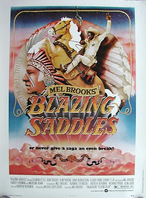
3. BLAZING SADDLES John and Andrea both told me the story of how this image came about. Mel Brooks was having a really hard time getting what he wanted for a poster, so a friend of John’s asked if he’d take a crack at it, but he only had 24 hours to create the image. Incorporating great sight gags like the Gucci saddle bags and “Hi, I’m Mel, Trust me!” on the coin. Mel loved it, and the day the posters went up, they got a call to come down to the center of LA. It was everywhere; on billboards, sides of buildings, fences, buses…His art was everywhere and overnight he became in extremely high demand in Hollywood.
Andrea Alvin: “This was the one that started it all. This poster had a unique look from most movie posters at the time. Most illustrated posters were traditional montages with characters from the film and maybe some scenic elements. This poster was full of jokes and elements that were from the movie, but not trying to portray a scene from the movie. It was a very formal composition with the main elements in the center of the poster.”
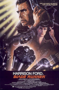
2. BLADE RUNNER Andrea and I went around and around as to which should occupy 1st and 2nd place on this list. I love the movie Blade Runner, and the art is very important as part of the Scifi classic’s history. E.T. is considered one of the best movie posters in history, but the movie doesn’t have the same historic significance. Ultimately I had to go with the art itself instead of the movie it represented…Blade Runner’s poster was created originally with 2 main focuses; the architecture and replicant Roy Batty. However, since Harrison Ford had just been in some huge hits, his contract said his image had to be the biggest in the poster. (clearly an early sign of the barrage of photo posters of lead stars just standing there to which we are now subjected) He ultimately designed the image with Deckard (Ford’s character) with bright light shining from behind him, but looking focused and decidedly anti-heroic. Apart from it creating an interesting balance of light, negative space, and detailed imagery, It warns the audience of the story’s and central character’s moral ambiguity.
Andrea Alvin: “Other artists try to claim that they did the Blade Runner poster. John worked directly with Ridley Scott, discussing the needs of the movie poster. It is a memorable image of Harrison Ford. It shows our hero, the leading man, beat up, tired, sweaty and with a growth of stubble on his face. This was not the usual star portrait. It contrasts so beautifully with the cool, elegance of Sean Young’s replicant character. The architecture was an important feature, like another character, and John’s art featured it prominently. His art has been the image brand for Blade Runner for all of these years.”
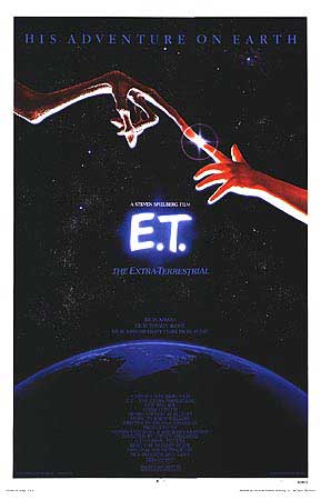
1. E.T. The Extra terrestrial Based on the Sistine Chapel ceiling image by Michelangelo, this art is the only movie poster ever to win a Saturn Award. It also won the Hollywood Reporter Key Art Award’s grand prize. There was such anticipation represented here. No one had been allowed to see what the alien looked like, so it was a little peek into the interaction that was in store, teasing scifi fans into the theaters. Also, it placed the art of cinema in the same realm as the highest form of fine art, as created by one of the masters…It continues to be seen as one of the best movie posters created in the last 40 years. Andrea Alvin: “This was the big one that didn’t get away. ET was the top grossing movie of all time for quite a number of years. The poster was so iconic and universal that it was used for worldwide advertising. There is often a different campaign for various international markets. The image was very universally understood. It was licensed and on everything from key rings to beach towels. It was everywhere and on everything. Our daughter Farah posed for the hand of Elliot. No matter what else she might do in her career on Broadway, many movie fans will always know her for that!” d appreciate how the greatest posters offered a unique mix of artistic beauty and skilled problem solving.
Let’s take time to thank inwardly those creative and inventive artists who have excited us on to see the next movie. All no less fine artists than any Michelangelo, but instead of the Vatican, they worked for Hollywood. Especially John Alvin.
Many of you perhaps didn’t know just how prolific and impressive his body of work really is. Alvin passed away in 2008, and It is high time a book, hopefully the first of several, is being released about his career and important place in the history of film.
For those who rightly bemoan the bland uninspired posters created today, he is missed, but we move and art lovers have his beautiful creations as part of our popular culture.
Thanks, John!